In a WordPress settings page 3rd-party developers can inject their own settings fields / HTML with action hooks, but you cannot do the same if you decide to build your plugin’s settings page in React.
This article explores the options to make our React Components extendible such that 3rd-party developers can easily inject their own components in them.
We are going to use SlotFillProvider, Slot, Fill and PluginArea Gutenberg React Components.
We’re going to build a very simple settings page. For the sake of simplicity of this article, we won’t complicate it by writing any server-side logic to save the fields, nor will cover managing the state of our application because our focus is just rendering our components and allowing other developers to render their own components.
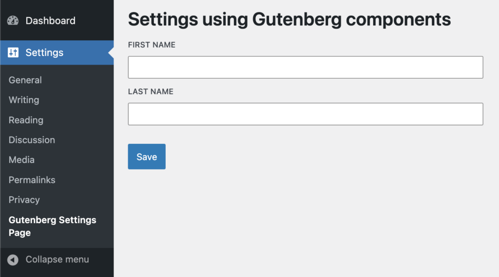
So, we will create an AdminSettings Component that renders First Name, Last Name text fields and a Save button.
import { __ } from '@wordpress/i18n';
import {
    BaseControl,
    TextControl,
    Button,
} from '@wordpress/components';

export const AdminSettings = () => {
    return (
        <>
            <h1>{ __( 'Settings using Gutenberg components' ) }h1>

            <BaseControl label={ __( 'First Name' ) }>
                <TextControl/>
            BaseControl>

            <BaseControl label={ __( 'Last Name' ) }>
                <TextControl/>
            BaseControl>

            <br />

            <Button variant='primary'>
                { __( 'Save' ) }
            Button>

    );
};
Slot and Fill ComponentsIf we were to compare the behavior with the PHP hooks, the I’d say Slot is similar to what do_action() does and Fill is similar to add_action().
As a plugin developer, you usually provide both the Slot and Fill. 3rd-party developers will inject their Components in this Slot using Fills. But we will do it differently. Instead of relying on other developers to implement Fills, we will expose a component on the global window object that implement Fills.
A Slot and a Fill is connected through the name attribute. For example:
<Slot name="additional-fields-area"/>
<Fill name="additional-fields-area">
    <TextControl label="Injected field"/>
Fill>
They are only connected if both share the same value for the name attribute.
SlotFillProviderSlotFillProvider is a Context provider for Slot and Fill. When you’re using Slot-Fill, you must ensure that both Slot and Fill are inside the SlotFillProvider, else it won’t work.
When you’re building an extendible Gutenberg block, you don’t need to use SlotFillProvider because the entire Gutenberg editor Component is already inside it. But if you’re building an extendible component which will be used outside of the Gutenberg editor, then you must use it.
Fill worksAs long as Fill is inside the SlotFillProvider, you can render it anywhere, it doesn’t matter. Whatever is between the Fill open and close tags will always be rendered where the connected Slot is.
The SlotFill mechanism is built using React Portals.
Slot to our Settings Componentimport { __ } from '@wordpress/i18n';
import { PluginArea } from '@wordpress/plugins';
import {
BaseControl,
TextControl,
Button,
SlotFillProvider,
Slot
} from '@wordpress/components';
export const AdminSettings = () => {
return (
<SlotFillProvider>
<h1>{ __( 'Settings using Gutenberg components' ) }h1>
<BaseControl label={ __( 'First Name' ) }>
<TextControl/>
BaseControl>
<BaseControl label={ __( 'Last Name' ) }>
<TextControl/>
BaseControl>
<Slot name="gutenberg-settings-additional-fields" />
<br />
<Button variant='primary'>
{ __( 'Save' ) }
Button>
SlotFillProvider>
);
};Great! We’re already halfway into building an extendible component.
Now remember I said in the previous point – Fill has to be inside the SlotFillProvider for this to work. You might wonder, how can 3rd-party developers add a Fill here? This will be explained next.
registerPluginGutenberg editor provides a number of SlotFills to allow developers to inject their Components in specific areas of the editor. You may have already used some of them already. If you remember, you may have done something like:
import { registerPlugin } from '@wordpress/plugins';
import { __ } from '@wordpress/i18n';
import { PluginPostPublishPanel } from '@wordpress/editor';

registerPlugin( 'third-party-plugin', {
    render: InjectSomeText,
} );

function InjectSomeText() {
    return (
        <PluginPostPublishPanel>
            <p>Post Publish Panelp>
        PluginPostPublishPanel>
    );
}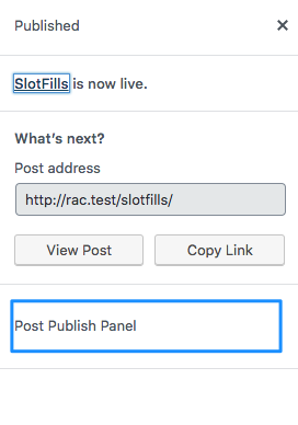
Gutenberg provides the following SlotFills:
If InjectSomeText does not return at least one of these, then whatever the component returns won’t be rendered anywhere. So it is clear – The Components rendered by registerPlugin must return at least one of the above.
But why is that? Why does registerPlugin refuse to render a Component that does not return one of the core SlotFills?
This is because, the core SlotFills return Fill components that are connected to the pre-defined Slot areas. And these Fill components are rendered inside PluginArea components.
PluginAreaThe registerPlugin function is very closely related to the PluginArea component and they work together. Let’s try to understand it with a practical example.
import { __ } from '@wordpress/i18n';
import {
    BaseControl,
    TextControl,
    Button,
    SlotFillProvider,
    Slot,
    Fill
} from '@wordpress/components';

export const AdminSettings = () => {
    return (
        <SlotFillProvider>
            <h1>{ __( 'Settings using Gutenberg components' ) }h1>

            <BaseControl label={ __( 'First Name' ) }>
                <TextControl/>
            BaseControl>

            <BaseControl label={ __( 'Last Name' ) }>
                <TextControl/>
            BaseControl>

            <Slot name="gutenberg-settings-additional-fields" />

            <br />

            <Button variant='primary'>
                { __( 'Save' ) }
            Button>
        SlotFillProvider>
    );
};

window.PluginGutenbergSettingsFields = ( { children } ) => {
    return (
        <>
            <Fill name="gutenberg-settings-additional-fields">
                { children }
            Fill>

    );
};
Similar to how core provides us with a list of SlotFills, we created a custom SlotFill Component called PluginGutenbergSettingsFields and exposed it on the global window object, so that other developers can easily use it with registerPlugin.
But you might wonder, wait! Didn’t I mention previously that Fill should be inside the same SlotFillProvider ? If other 3rd-party developers use PluginGutenbergSettingsFields to inject code, where would it be rendered? – That’s a good question!
This is where, PluginArea is important!
import { __ } from '@wordpress/i18n';
import { PluginArea } from '@wordpress/plugins';
import {
    BaseControl,
    TextControl,
    Button,
    SlotFillProvider,
    Slot,
    Fill
} from '@wordpress/components';

export const AdminSettings = () => {
    return (
        <SlotFillProvider>
            <h1>{ __( 'Settings using Gutenberg components' ) }h1>

            <BaseControl label={ __( 'First Name' ) }>
                <TextControl/>
            BaseControl>

            <BaseControl label={ __( 'Last Name' ) }>
                <TextControl/>
            BaseControl>

            <Slot name="gutenberg-settings-additional-fields" />

            <PluginArea/>

            <br />

            <Button variant='primary'>
                { __( 'Save' ) }
            Button>
        SlotFillProvider>
    );
};

window.PluginGutenbergSettingsFields = ( { children } ) => {
    return (
        <>
            <Fill name="gutenberg-settings-additional-fields">
                { children }
            Fill>

    );
};
I will explain the entire flow in the next section.
As a 3rd-party developer, I would like to add a ToggleControl Component to the settings page.
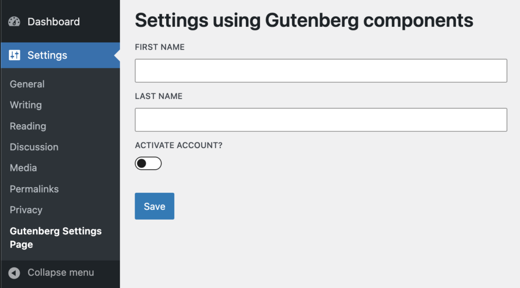
mport { registerPlugin } from '@wordpress/plugins';
import { __ } from '@wordpress/i18n';
import {
    BaseControl,
    ToggleControl
} from '@wordpress/components';

const { PluginGutenbergSettingsFields } = window;

registerPlugin( 'third-party-plugin', {
    render: InjectAdditionalFields,
    scope: PluginGutenbergSettingsFields.scope // Ignore this for now.
} );

function InjectAdditionalFields() {
    return (
        <PluginGutenbergSettingsFields>
            <BaseControl label={ __( 'Activate Account?' ) }>
                <ToggleControl/>
            BaseControl>
        PluginGutenbergSettingsFields>
    );
}– registerPlugin renders InjectAdditionalFields where the PluginArea component is.
– PluginArea renders a hidden div which renders the contents of InjectAdditionalFields.
– InjectAdditionalFields returns our custom SlotFill PluginGutenbergSettingsFields.
– PluginGutenbergSettingsFields renders Fill next to the Slot and also inside the same SlotFillProvider
– Slot with the help of SlotFillProvider renders content that is between the Fill tags.
Obviously, the Toggle Field will require access to the AdminSettings state data. For example, if you want to make the Toggle Field conditional depending on the value of some other field?
Slot component accepts a prop called as fillProps. This is how you do it:
But to access this data, AdminSettings, PluginGutenbergSettingsFields and InjectAdditionalFields needs to be updated like the following:
import { useState } from '@wordpress/element';

export const AdminSettings = () => {

    const [ appData, setAppData ] = useState( { fname: 'Siddharth', lname: 'Thevaril' } );

    return (
        <SlotFillProvider>
            <h1>{ __( 'Settings using Gutenberg components' ) }h1>

            <BaseControl label={ __( 'First Name' ) }>
                <TextControl value={ appData.fname }/>
            BaseControl>

            <BaseControl label={ __( 'Last Name' ) }>
                <TextControl value={ appData.lname }/>
            BaseControl>

            <Slot name="gutenberg-settings-additional-fields" fillProps={ { appData, setAppData } } />

            <PluginArea />

            <br />

            <Button variant='primary'>
                { __( 'Save' ) }
            Button>
        SlotFillProvider>
    );
};

window.PluginGutenbergSettingsFields = ( { children } ) => {
    return (
        <>
            <Fill name="gutenberg-settings-additional-fields">
                { ( fillProps ) => children( fillProps ) }
            Fill>

    );
};
And for the plugin:
function InjectAdditionalFields() {
    return (
        <PluginGutenbergSettingsFields>
            {
                ( fillProps ) => {
                    return (
                        <BaseControl label={ __( 'Activate Account?' ) }>
                            <ToggleControl />
                        BaseControl>
                    )
                }
            }
        PluginGutenbergSettingsFields>
    );
}
If your settings page is large and the app data is complex, I would suggest to implement a separate data store instead of passing app state via fillProps.

I’m Kamal, a WordPress developer focused on plugins, APIs, and scalable products.
Learn More